在數據分析上,常透過長條圖來比較不同項目的數據高低,本章節將透過顧客回購資料「CH3–6_顧客回購資料.csv」搭配長條圖,帶領讀者一窺顧客交易資料在商務上的應用。

一、導入套件包與資料集
透過程式碼1,載入本章節所需之套件包與顧客回購資料集,如下所示。
程式碼1:
# 套件包import pandas as pdimport numpy as npfrom datetime import timedelta, datetime, tzinfo, timezoneimport plotly.express as pximport plotly.offline as pyimport mathimport os# 資料集data = pd.read_csv(‘CH3–6_顧客回購資料.csv’, encoding=’utf-8-sig’).drop(columns=[‘Unnamed: 0’])data.head()
產出:
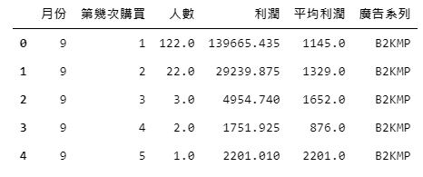
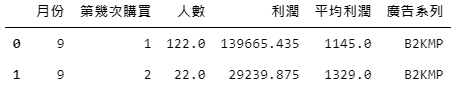
該資料集為 經過「店商交易資料.csv」提取2018年的資料加以整理後,所產出的一份回購資料,在該資料內我們透過區分不同廣告、月份以及顧客的為第幾次購買,來查看在不同情境下的購買人數以及貢獻利潤有多高。
舉圖2. 的此兩列為例,代表在九月時,因受到廣告系列「B2KMP」推播而促成第1次購買的顧客有122位、總共貢獻了1,389,665元的利潤,平均貢獻1,145元的利潤;而在九月時因受到廣告系列「B2KMP」推播而促成第2次購買的顧客有22位,總共貢獻了29,239元的利潤,平均貢獻1,145元的利潤,以此類推。
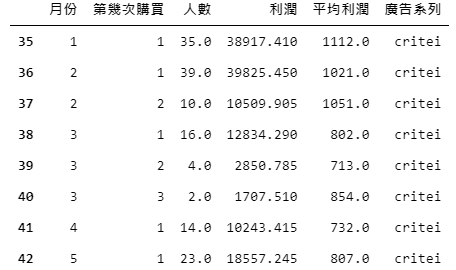
首先,我們將以廣告系列「critei」為例繪製長條圖,找出潛在的決策參考。透過程式碼2,篩選出「廣告系列」為「critei」的資料,如下。
程式碼2:
chosen_data = data[data['廣告系列']=='critei']chosen_data.head(8)
產出:
二、繪圖-長條圖
挑選好廣告資料後,便可透過套件包plotly進行圖片繪製。
我們根據資料集中的「月份」設定x值、透過「平均利潤」設定y值,並透過「第幾次購買」來區分長條的顏色,相較於之前的繪圖程式,新增了兩項設定以做到直觀地繪圖效果:
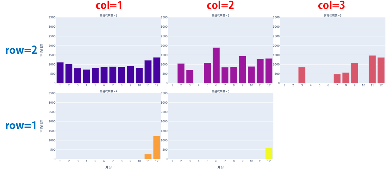
1. facet_col:可根據輸入欄位內的不同數值、類別,個別繪製子圖。此圖根據「第幾次」購買區分。
2. facet_col_wrap:繪製子圖的欄位數量,此圖設定為3欄。
如下程式碼3所示。
程式碼3:
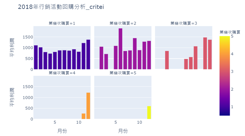
fig = px.bar(chosen_data,x = ‘月份’, y = ‘平均利潤’, color = ‘第幾次購買’, title = ‘2018年行銷活動回購分析_critei’,facet_col=”第幾次購買”, facet_col_wrap=3)fig.show()
產出:
接著,透過下方程式碼4,進一步設定長條圖的佈景主題,以達到美觀易讀的效果。
程式碼4:
# 修改條寬for pdata in fig.data:pdata[“width”] = 0.8# 佈景主題設定fig.update_layout(width=1600, height=800, showlegend=False, xaxis_range=(0.5, 12.5), yaxis_range=(0, 3500))fig.layout.coloraxis.showscale = False # 隱藏比例尺fig.update_xaxes(showticklabels=True, tickmode=’linear’) # 顯示x座標所有數值fig.update_yaxes(showticklabels=True) # 顯示y座標數值fig.show()
產出:
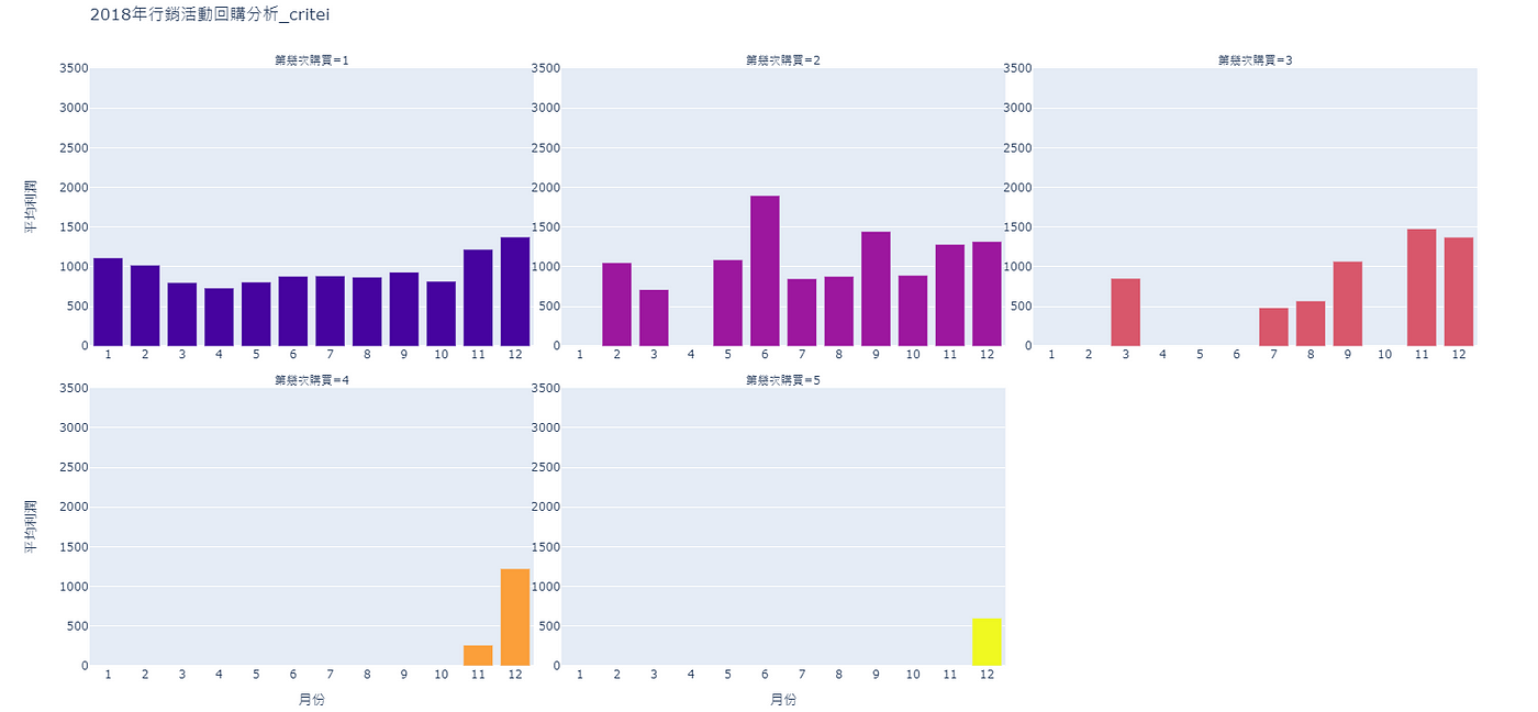
根據圖5.,雖然可以根據子圖進行比較、分析,但在缺乏比較標準的情況下會較難找尋決策參考,因此接下來會依序為圖片繪製上年均、月均利潤線。
三、繪圖-年均利潤折線圖
透過程式碼5,計算出年均利潤,將值存入新增串列「year_mean_profit」中,如下。
程式碼5:
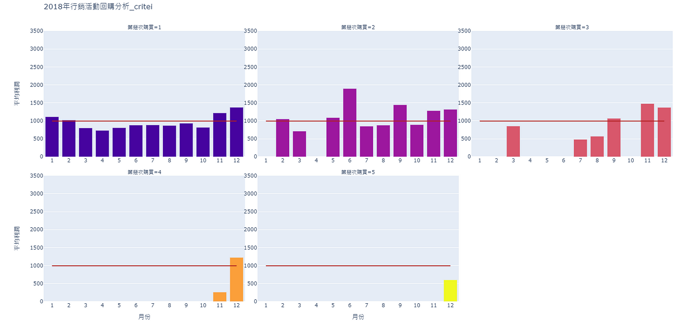
print(‘2018年的平均利潤為:’ ,round(chosen_data[‘平均利潤’].mean(),2))year_mean_profit = [round(chosen_data[‘平均利潤’].mean(),2)]*12
產出:
2018年的平均利潤為: 993.16然而算出年均利潤後,並不能使用往常的方式直接繪圖,在區分出多張子圖後,需指定子圖的欄、列座標,才可在該子圖上進行繪圖。
透過程式碼6,可幫助我們掌握共有幾列的子圖。
程式碼6:
print('該資料集內共有' ,math.ceil(chosen_data["第幾次購買"].nunique()), '種類型的回購資料,')print('分別為:',chosen_data["第幾次購買"].unique().tolist())total_row = math.ceil(chosen_data["第幾次購買"].nunique()/3)print('因此共有', total_row, '列的子圖')
產出:
該資料集內共有 5 種類型的回購資料,分別為: [1, 2, 3, 4, 5]因此共有 2 列的子圖
子圖會以一列3張圖的方式呈現,但繪製最後一列時則可能有所不同,根據程式碼7,計算最後一列共會出現幾張子圖。
程式碼7:
if total_row==1 :first_row_col = chosen_data["第幾次購買"].nunique()else:first_row_col = chosen_data["第幾次購買"].nunique()%3print('第一列會有', first_row_col, '張圖片')
產出:
第一列會有 2 張圖片蒐集完相關資訊後,便可根據迴圈與判斷式,在不同的情況下為每張子圖繪製年平均線。
程式碼8:
# 如果圖形不只有一列:if total_row !=1:# 那就透過for迴圈依序指定欄與列的編碼for row in range(1, total_row+1):# 如果現在在繪製第一列時:if row == 1:# 便根據第一列有的圖片數量給與列編碼for col in range(1, first_row_col+1):fig.add_scatter(x = list(range(1, 13)), y = year_mean_profit, name = '年每人平均利潤', row=row, col=col, line=dict(color="firebrick"), mode="lines")# 如果現在不是繪製第一列時:else:# 就依序給予1~3的列編碼for col in range(1, 4):fig.add_scatter(x = list(range(1, 13)), y = year_mean_profit, name = '年每人平均利潤', row=row, col=col, line=dict(color="firebrick"), mode="lines")# 如果圖形只有一列:else:# 便根據第一列有的圖片數量給與列編碼for col in range(1, first_row_col+1):fig.add_scatter(x = list(range(1, 13)), y = year_mean_profit, name = '年每人平均利潤', row=1, col=col, line=dict(color="firebrick"), mode="lines")fig.show()
產出:
四、繪圖-月均利潤折線圖
繪製完年均線後,我們可用同樣地概念繪製月均線,下方程式碼9可協助計算每個月份的平均利潤,存入新增串列「mon_mean_profit」。
程式碼9:
mon_mean_profit = []for mon in chosen_data['月份'].unique():print(str(mon)+'月的平均利潤為:' ,round(chosen_data[chosen_data['月份']==mon]['平均利潤'].mean(),2))mon_mean_profit.append(round(chosen_data[chosen_data['月份']==mon]['平均利潤'].mean(),2))
產出:
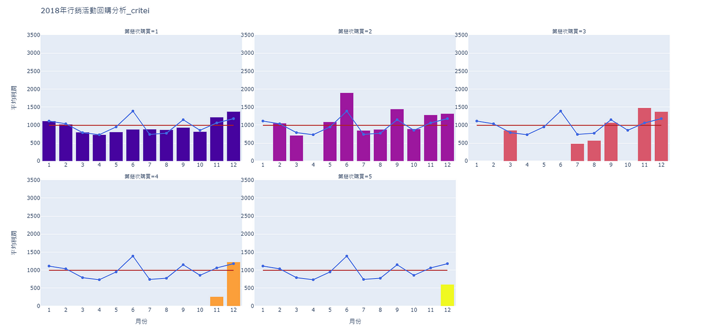
1月的平均利潤為: 1112.02月的平均利潤為: 1036.03月的平均利潤為: 789.674月的平均利潤為: 732.05月的平均利潤為: 947.56月的平均利潤為: 1388.57月的平均利潤為: 740.338月的平均利潤為: 773.09月的平均利潤為: 1149.010月的平均利潤為: 854.511月的平均利潤為: 1060.512月的平均利潤為: 1178.6
完成後便可根據程式碼10,繪製月均線。
程式碼10:
# 如果圖形不只有一列:if total_row !=1:# 那就透過for迴圈依序指定欄與列的編碼for row in range(1, total_row+1):# 如果現在在繪製第一列時:if row == 1:# 便根據第一列有的圖片數量給與列編碼for col in range(1, first_row_col+1):fig.add_scatter(x = chosen_data['月份'].unique(), y = mon_mean_profit, name = '月每人平均利潤', row=row, col=col, line=dict(color="royalblue"))# 如果現在不是繪製第一列時:else:# 就依序給予1~3的列編碼for col in range(1, 4):fig.add_scatter(x = chosen_data['月份'].unique(), y = mon_mean_profit, name = '月每人平均利潤', row=row, col=col, line=dict(color="royalblue"))# 如果圖形只有一列:else:# 便根據第一列有的圖片數量給與列編碼for col in range(1, first_row_col+1):fig.add_scatter(x = chosen_data['月份'].unique(), y = mon_mean_profit, name = '月每人平均利潤', row=1, col=col, line=dict(color="royalblue"))fig.show()
產出:
五、產出分析成果
了解一系列的繪圖方法後,便可透過程式碼11,根據不同的廣告系列進行繪圖產出,如下所示。
程式碼11:
# 迴圈逐一挑選廣告系列for ad in data['廣告系列'].unique().tolist():# 選取該廣告系列的回購資料chosen_data = data[data['廣告系列']==ad]## 繪圖-長條圖fig = px.bar(chosen_data,x = '月份', y = '平均利潤', color = '第幾次購買', title = '2018年行銷活動回購分析_'+ad,facet_col="第幾次購買", facet_col_wrap=3)# 修改條寬for pdata in fig.data:pdata["width"] = 0.8# 佈景主題設定fig.update_layout(width=1600, height=800, showlegend=False, xaxis_range=(0.5, 12.5), yaxis_range=(0, 3500))fig.layout.coloraxis.showscale = False # 隱藏比例尺fig.update_xaxes(showticklabels=True, tickmode='linear') # 顯示x座標所有數值fig.update_yaxes(showticklabels=True) # 顯示y座標數值## 繪圖-年均利潤折線圖# 計算2018年平均利潤year_mean_profit = [round(chosen_data['平均利潤'].mean(),2)]*12# 計算共有幾列子圖total_row = math.ceil(chosen_data["第幾次購買"].nunique()/3)# 計算第一列會有幾張圖片if total_row==1 :first_row_col = chosen_data["第幾次購買"].nunique()else:first_row_col = chosen_data["第幾次購買"].nunique()%3# 依序為每張子圖繪製「年均利潤折線圖」# 如果圖形不只有一列:if total_row !=1:# 那就透過for迴圈依序指定欄與列的編碼for row in range(1, total_row+1):# 如果現在在繪製第一列時:if row == 1:# 便根據第一列有的圖片數量給與列編碼for col in range(1, first_row_col+1):fig.add_scatter(x = list(range(1, 13)), y = year_mean_profit, name = '年每人平均利潤', row=row, col=col, line=dict(color="firebrick"), mode="lines")# 如果現在不是繪製第一列時:else:# 就依序給予1~3的列編碼for col in range(1, 4):fig.add_scatter(x = list(range(1, 13)), y = year_mean_profit, name = '年每人平均利潤', row=row, col=col, line=dict(color="firebrick"), mode="lines")# 如果圖形只有一列:else:# 便根據第一列有的圖片數量給與列編碼for col in range(1, first_row_col+1):fig.add_scatter(x = list(range(1, 13)), y = year_mean_profit, name = '年每人平均利潤', row=1, col=col, line=dict(color="firebrick"), mode="lines")## 繪圖-月均利潤折線圖# 計算月均利潤mon_mean_profit = []for mon in chosen_data['月份'].unique():mon_mean_profit.append(round(chosen_data[chosen_data['月份']==mon]['平均利潤'].mean(),2))# 依序為每張子圖繪製「月均利潤折線圖」# 如果圖形不只有一列:if total_row !=1:# 那就透過for迴圈依序指定欄與列的編碼for row in range(1, total_row+1):# 如果現在在繪製第一列時:if row == 1:# 便根據第一列有的圖片數量給與列編碼for col in range(1, first_row_col+1):fig.add_scatter(x = chosen_data['月份'].unique(), y = mon_mean_profit, name = '月每人平均利潤', row=row, col=col, line=dict(color="royalblue"))# 如果現在不是繪製第一列時:else:# 就依序給予1~3的列編碼for col in range(1, 4):fig.add_scatter(x = chosen_data['月份'].unique(), y = mon_mean_profit, name = '月每人平均利潤', row=row, col=col, line=dict(color="royalblue"))# 如果圖形只有一列:else:# 便根據第一列有的圖片數量給與列編碼for col in range(1, first_row_col+1):fig.add_scatter(x = chosen_data['月份'].unique(), y = mon_mean_profit, name = '月每人平均利潤', row=1, col=col, line=dict(color="royalblue"))# 將成果另存新檔py.plot(fig, filename='CH3-6產出成果_2018年行銷活動回購分析_'+ad, auto_open=True) # 網頁檔fig.write_image('CH3-6產出成果_2018年行銷活動回購分析_'+ad+'.png') # 圖檔
透過回購分析圖,可找到隱含的決策參考,我們以廣告「critei」與廣告「GINEP」為例,兩者的分析圖如下所示。

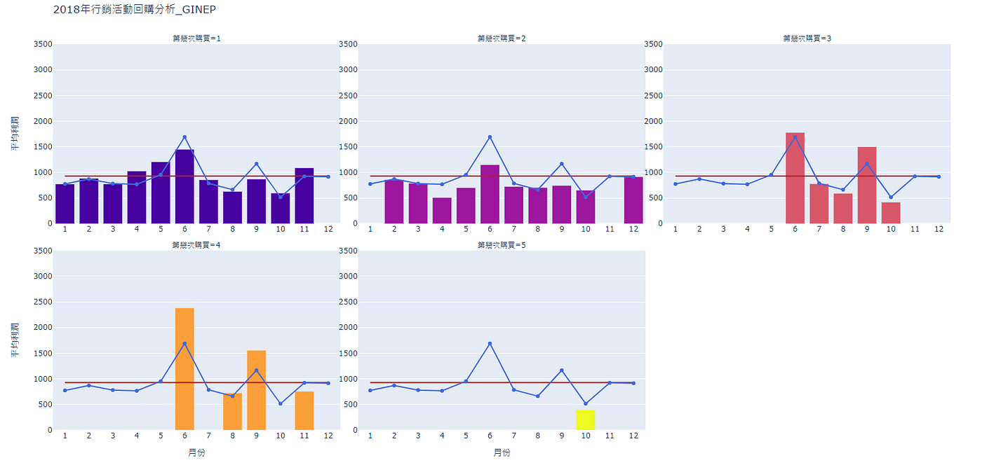
透過兩廣告系列可發現,當消費者第一次回購(第幾次購買=2)時,消費金額與第一次購買相差不大,但隨著次數逐漸增加,購買金額與人數呈現明顯地下滑,驗證了廣告持續投放效益遞減的現象。
此外我們也可以透過圖中的數據發現,受廣告系列「critei」促成的交易普遍在年初年末帶來的利潤高於平均;而受廣告系列「GINEP」促成的交易則在年中時表現較佳,在後續針對不同時間、回購次數的客人時,都可以作為推播廣告挑選的參考。
以上為本章節的長條圖教學,善用視覺化分析,便也可將資料變成黃金哦。
作者:徐子皓、張友志(臺灣行銷研究特邀作者)、鍾皓軒(臺灣行銷研究有限公司創辦人)